Horizon Line

Color - My Palette

Introduction 

A basic understanding of color is essential to art.  Since this information is so readily available in numerous sources, I will not discuss this in detail.  However, I want  to point out some things that I think are essential to painting.  I begin with the color wheel and make a few fundamental and key points about color before covering what I consider to be a critical principle regarding the use of color in oil painting - color harmony.  I conclude by making comments about some specific colors and the colors that I particularly like.   The article on Depth Perspective also discusses some key points regarding how color can contribute to a achieving a sense of depth in a painting.

Definitions. There are many terms in use today that pertain to the subject of color and it can get confusing.  For the sake of these articles, I use the following definitions:

Hue - The "color" from the color wheel, or mixed from those colors. For instance, red, blue, purple, etc.

Value - The degree of lightness or darkness of the "color".

Color - A combination of the Hue and Value.   

Palette - The colors used in painting             

The Color Wheel 

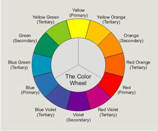
It is helpful to look at the color wheel when learning about color. The three basic colors, or Primary colors, are yellow, red, and blue. In theory, all other colors can be made by mixing these three.  Mixing Yellow and Red produces Orange: mixing Red and Blue produces Violet: and mixing Blue and Yellow produces Green.  Orange, Violet, and Green, are secondary Colors.  Mixing Primary colors, with adjacent Secondary colors produces the Tertiary colors. Colors that are opposite each other on the color wheel are called Complementary Colors because they look good together or complement each other.  Each Primary color has a compement that is made from the other two Primary colors.

Mobirise

In theory, white is the combination of all colors, and black is the absence of any color. Theory is reality when working with light but when working with oil colors one cannot produce white by mixing all of the colors. In fact, the opposite is closer to what happens: mixing all the colors almost produces black, not white.

In a perfect world then, artists would only need three tubes of paint: yellow, blue and red and we could mix every other color we want, including white.  While this is not the case, the fact is that, with experience, the artist can learn to mix most of the colors that are needed for a particular painting and in so doing will create a more harmonious painting than by using a different tube of paint for each color that is used.

Color Harmony 

Color Harmony is essential to good landscape painting. As mentioned, many colors can be created by mixing of other colors. Doing this instead of using another tube contributes to color harmony, which is an essential element of a good landscape painting.  For instance, green can be mixed using blue and yellow and if done with the same blue and yellow that is used in the rest of the painting, results in greater color harmony than if a tube of green color is used.

For example, look at the Bryce Canyon painting, to the right.  For this painting my Palette consisted of only five tubes of paint: Perylene Crimson, Ultramarine Blue, Cadmium Yellow Deep, Dioxin Purple and White. This is essentially the three primary colors - red, yellow, and blue, plus purple and white.  Note that purple could be created from the red and blue hues but, in the case, dioxin purple works better.  In addition to using a limited Palette, color harmony is achieved by mixing each color in most of the elements of the painting. For instance, in Bryce Canyon, Dioxin Purple is in every element of the painting. The same is true for Cadmium Yellow Deep and, to a somewhat lesser extent, Perylene Crimson and Ultramarine Blue. The geens were created using ultramarine Blue and Cadmium Yellow Deep, tinted to varying degrees with the other colors

Mobirise

As another example, look at Appalachian White Water. In this case, I used the same colors as in Bryce Canyon, except that I used Burnt Umber instead of Dioxin Purple. Note the dramatic difference in the brilliance and feel of the painting which results primarily from how the colors are mixed. In this case, crimson and yellow were used only to tint the other colors rather than as dominant colors. Note the atmospheric feeling of this painting which is achieved by using toned-down colors.

Mobirise

A common technique for achieving color harmony is to mix one of the earth tones, such as Burnt Umber or Burnt Sienna, into all of the colors. This is a very effective technique, but it tends to "tone down" or mute the colors, so I do not use this when wanting a pure and deep look to my colors. This is especially true in skies, where I generally prefer pure colors.

Some Comments on Specific Colors 

                 Gray

Grays can be created by mixing a color with its complement: Red with Green; Yellow with Violet; or Blue with Orange. The degree to which the color appears gray depends upon amount of the complement that is mixed with the basic color.  With just a little, one gets a "grayed down" or "cut" primary color.  As more of the complement is added, the color moves toward a perfect gray.  Note that colors and their complements are always a warm and a cool color. Therefore, one can mix warm, neutral, or cool grays, depending upon the balance of the warm and cool colors. Grays should always be mixed rather than used from a tube, for the same reason that black from a tube should not be used.

                Black 

Don't use black from a tube ! It is much better to mix a black that can be tinted slightly towards one of the mixing colors.  Pure black is simply not harmonious.  Perylene Crimson and Pthalo Green create a wonderful dark "black" that can be tined a bit toward the red or the green.  It can also be mixed to provide a pure black in unusual cases where a pure black is needed. Ultramine Blue and Burnt Umber also produces a nice dark, almost black color. This combination was used extensively Appalachian Whitewater.

                Green 

Green is the most difficult color to deal with in painting.  Gurnery has an excellent chapter on The Green Problem in his Color and Light book (see the footnote). My approach to greens has evolved over the years.   At this point I use two greens: one that I mix using Ultramarine Blue and Cadmium Yellow Deep and the second is Chromium Green Oxide.  I primarily use the first but in a painting where I need more variety than I can satisfactorily create with the first method, I use Chromium Green Oxide. But, even though though it is not overly intense, I usually tint it to tone it down slighly. 

My Palette 

The following are the colors that I primarily use:   

Pthalo Blue

Ultramine Blue  

Cerulean Blue  

Pthalo Green

Chromium Green Oxide

Cadmium Yellow Deep

Perylene Crimson

Dioxin Purple

Burnt Umber

Burnt Sienna 

In addition, I use these these on occasion:   

Pthalo Yellow Green

Cadmium Red Light

Cadmium Yellow Pale

Naples Yellow

Raw Umber

Yellow Ochre

Mobirise

Footnote:

For a more advanced discussion of color I suggest reading Color and Light - A Guide for the Realist Painter by James Gurney published by Andrews McMeel Publishing, LLC. This is an excellent book that includes many well-presented topics in addition to the topic of color.

Mobirise

Designed with Mobirise ‌

Offline Website Software