Introduction
A sense of depth is frequently an essential element to an interesting and pleasing landscape painting and can give the viewer a feeling that they can "walk right into the painting." There are five techniques that are commonly used to help achieve that sense and this article provides a brief discussion of each. Make your own website in a few clicks!
Linear Perspective
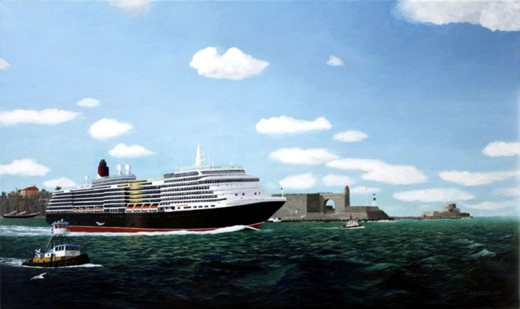
The proper use of linear perspective is critical to most, if not all, landscape paintings, even in cases where that perspective may not be obvious. The most obvious example of linear perspective is a straight road running from the foreground to the background. However, linear perspective may be less obvious, but just as important, in a painting of a woods where the decreasing heights of the trees results from linear perspective. Notice, in Queen Victoria departing Rhodes, right, how the relative size of the ship, the middle ground structure to it's right and the structure on the horizon line decrease in size, thus providing a sense of depth.
Making the trees decrease in size from the foreground to the background is intuitive but, perhaps, not so intuitive, is the linear perspective as it applies to buildings, so it is important to have a basic understanding of that subject if buildings or similar structures are to be included in a painting. The article on Linear Perspective provides some guidance on this subject.Make your own website in a few clicks!
Objects tend to increase in value (become darker) as we move from the background to the foregroound and it is, thus, important to have this variance in landscape paintings with normal lighting conditions. As an example, notice the value of the water in the Queen Victoria painting as it varies from the horizon line to the foreground.
Lines of Composition
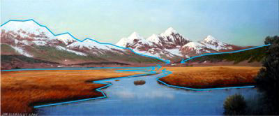
Composition lines in a painting can be used effectively to lead the eye from the front to the back of a picture, thus adding to the sense of depth. These lines can also be used to draw the viewers attention to a particular area of the picture. Look, for example, at Trout Waters and notice how the lines of the stream, the mountains, and the middle ground hills all lead the eye back to the point where the stream disappears behind the middle ground hill on the righ
Warm and Cool Colors
Colors tend to move from warm to cool as we move from the foreground to the background of a picture. Therefore "cooling" the picture as we move from foreground to the background gives a sense of depth. Look again at Trout Waters and note how the warmth of the grasses cools as they recede to the middle ground and note the predominately cool colors of the mountains. Notice how even the water changes from a warm blue - almost purple in the foreground - to a cooler blue as it recedes. This painting also illustrates the use of value to add a sense of depth. Note the decreasing value of the grasses and water from foreground to the middle ground.
Detail
While I think this is the most intuitive technique, it should still be mentioned that the degree of detail of objects decreases as we move the foreground to the background. One might be able to see individual leaves of a tree in the foreground, while in the middle ground the same tree may only show variances of value of hue in masses of foliage, and the same tree in the background may be depicted as only a glob of paint. This technique can also be used to some exaggeration to draw the viewer's eye to the subject. There is a striking example of this in one of Russell's paintings in the Amon Carter Museum in Ft. Worth where the face of the subject is rendered in great detail while the others around and even quite close to the subject are painted in much less detail - almost blurry.
Built with Mobirise
Free Web Site Maker